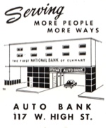
 The little car is even cuter than the building |
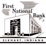 A highly conceptual First National Bank, Elkhart, Indiana |
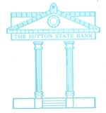 Perfect classicism |
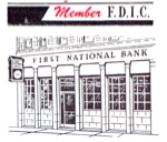 A less than massive bank facade |
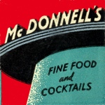 McDonnell's: Restaurant Moderne. |
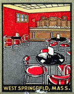 The room itself seems a bit stodgy, but the tables and chairs couldn't be more contempo |
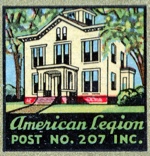 A future fixer upper for an urban pioneer |
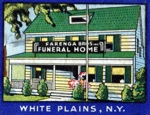 Good thing they rendered the pole in front of the building |
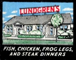 Charming |
 A palace in Queens |
 A North Woods classic in Rhinelander Wisconsin |
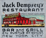 Hard to imagine a building like this at 8th and 50th |
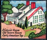 Too imposing to be quaint, at least in this rendering |
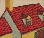 I actually have these exact shingles on my house. The roofers hated working with them |
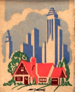 Best of both worlds |
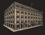 A very substantial hotel |
 A lovingly rendered factory |
 Ohio Match Co., industrial pride in Wadsworth, Ohio |
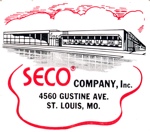 The Southern Equipment Company (SECO) was "known for quality racks, cabinets and hotel pans" |
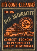 Dad always said, there's nothing like "cone-cleaned" |
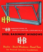 Really nice colors and typography from Cleveland, O |
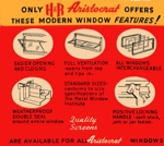 Great color and type |
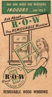 Nice window babe |
 Even a small specialty business could have a killer logo |
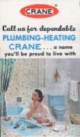 And 30 years later that blue will still be just so darling |
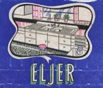 What's more mysterious, the weird spider thing on the floor or the contraption on top of the counter on the right? |
 Now this would be a classic bathroom in any era |
 A fine design exercise from Ohio |